UniHub App
UniHub was idealized to be an online learning platform that provides students with reliable college-level content, access to qualified tutors, and tools to track their progress, ensuring consistent and affordable learning support beyond the classroom.
Project duration:
October, 2024 to January, 2025 (to be continued)
The product:
Project overview
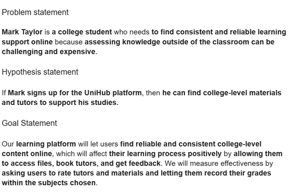
College students need to find consistent and reliable learning support online because assessing knowledge outside of the classroom can be challenging and expensive.
The goal:
To design an affordable app that provides reliable content, connects users with tutors, and offers tools for feedback and grade tracking to enhance their learning experience.
The problem:
My role:
Generalist UX Designer
Responsibilities:
Responsible for all design phases of the UX Design process.

Challenges and outcomes:
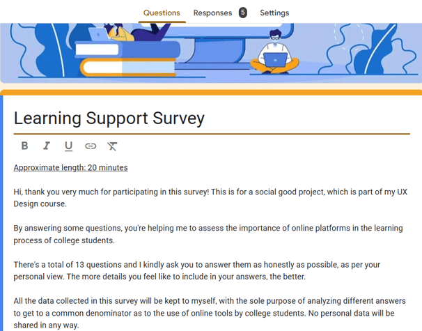
Understanding whether college students would use an online platform like UniHub to support their learning required conducting surveys and a competitive audit. While no existing platform offered all the tools I envisioned, the lack of direct references posed a design challenge. Additionally, finding participants for my survey without offering monetary incentives was difficult, but I got to connect with a community of indie hackers that allowed me to exchange contributions and build valuable contacts.


Design stages
See below some of the elements used in my design process:
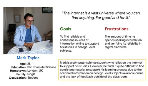
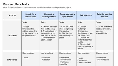
Persona: Mark Taylor
A Computer Science student representing the UniHub's target users, their goals and challenges.
Paper wireframes
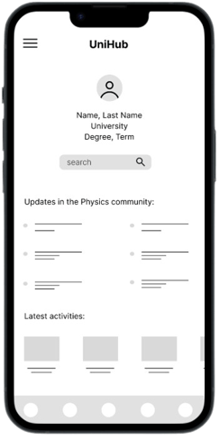
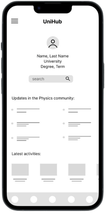
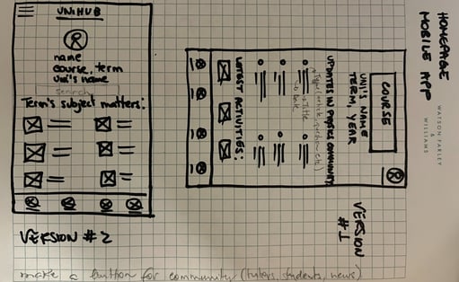
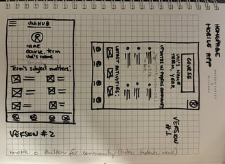
Two versions for the UniHub homepage: one focusing on community updates and the other on subject matters of the current term.


Competitive audit
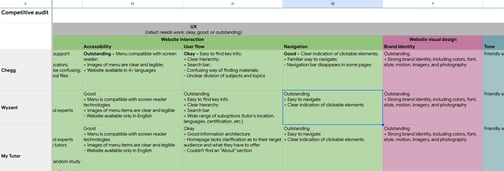
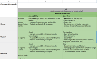
A competitive audit was conducted to compare the user experience of each direct and indirect competitor's website.
Low-fidelity prototype
A lo-fi prototype for the task of choosing a topic, a learning resource, and the options of taking a quiz and/or booking a tutor.
Methods applied to the design process
Check out below some methods commonly used in the UX field that I've made use of :
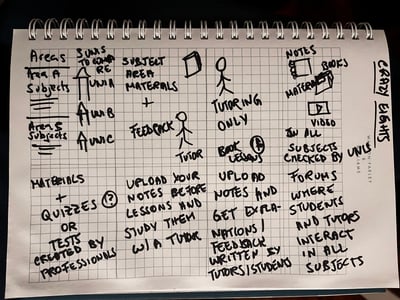
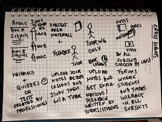
1. Rapid sketching ("Crazy Eights")
It's easy for me to overthink and find myself caught up in many details before moving on with my design. One way to push myself forward with what matters in the first instance is using a technique called "Crazy Eights", where I try to have as many ideas as possible within eight minutes, no matter how silly they look like. Rapid sketching allows for raw and authentic creativity so I can refine my work later, ensuring a faster pace.
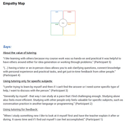
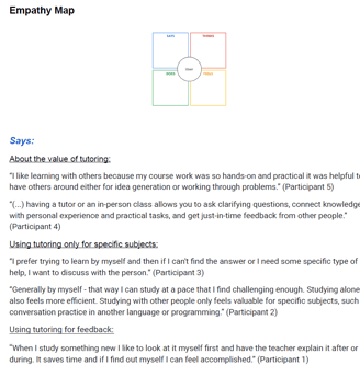
2. Empathy map
I based the organization of my survey's responses on the empathy map model. It helped me classify all responses within four categories (what each participant "says", "thinks", "does", and "feels" about a product or the idea of it). Subcategories were also created to give me clearer feedback, as not every statement by participants within a certain category might relate to the same thing.
Creating a user journey map helped me step into the shoes of college students using the app through the persona created for this project. It gave me a clearer view of their potential experiences, frustrations, and needs, helping me design features that are more likely to support them in their studies.
3. User Journey Map

Other considerations

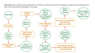

The user flow outlines the steps college students take to navigate the app, ensuring a seamless and intuitive experience from start to finish.

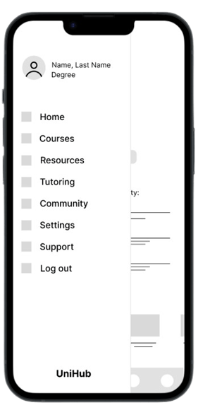
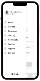
Slider navigation creates more visual space by compiling several links into a single spot.
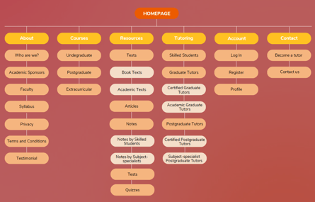
The sitemap organizes the website structure, showing how content and features are arranged to ensure easy navigation for users.
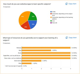
An online survey helped me understand the average profile and needs of my target users: college students.
