HomeSavings App
HomeSavings is an app to share expenses and set a savings goal among a household’s members.

Project duration:
March to July, 2024
The product:
Project overview
People from the same household can get lost when sharing expenses with each other, which can result in losses and lack of organization of their common finances. It gets particularly harder when they need to set a common savings goal.


The goal:
To design an app and a responsive website so people can be introduced to the product, register, and download it to track household expenses and save money with their housemates.
The problem:
My role:
Generalist UX Designer
Responsibilities:
Responsible for all design phases of the UX Design process, from initial research to test and iteration.
Challenges and outcomes:
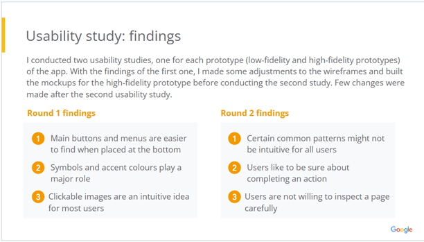
I’ve learned that the less, the better; instead of too much information or interaction on screens, users feel more at ease when they can accomplish tasks objectively. Icons, shapes, and shadows play an important role, for they clearly signalize basic functionalities of the app. Simple things that end up coming much more in handy than complex designs.
Design stages
See below some of the elements used in my design process:
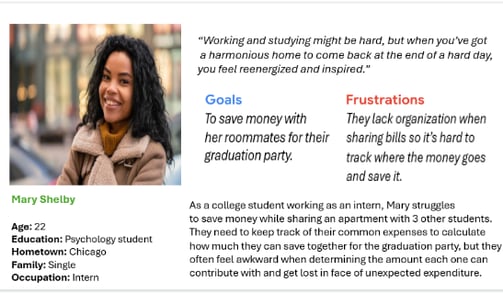
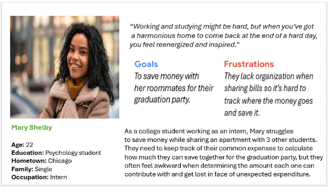
Persona: Mary Shelby
A college student who needs to track and manage household expenses to save money together with her roommates.
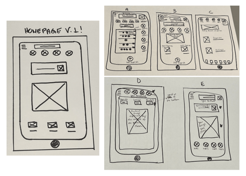
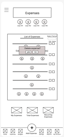
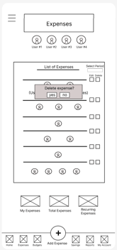
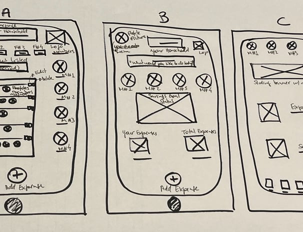
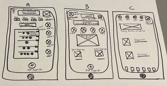
Paper wireframes
Coming up with the very first designs may not be easy, but it's exciting to see ideas gaining life...


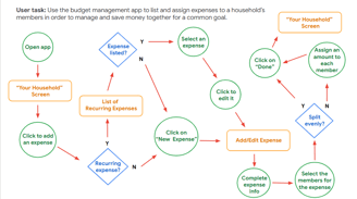
Low-fidelity prototype
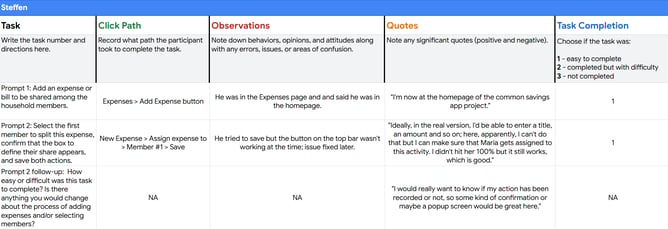
With the first prototype built on Figma, I could trace weak and strong points in my designs through usability testing.
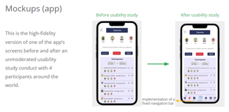
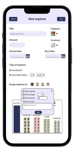
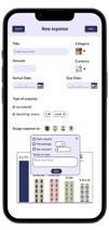
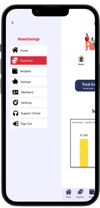
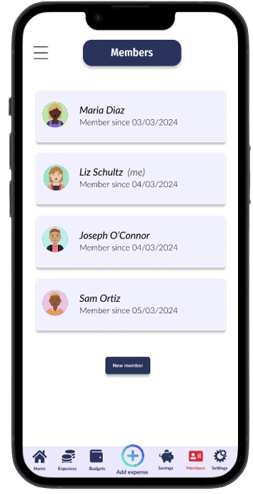
Mockups
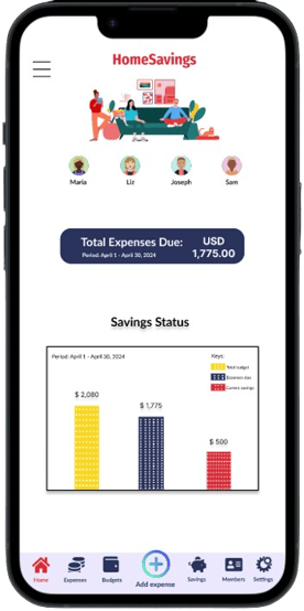
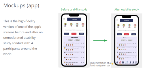
Contrary to the usability study with the lo-fi prototype, few changes were applied to the mockups since the users found the app visually pleasant and functional when testing the hi-fi prototype.
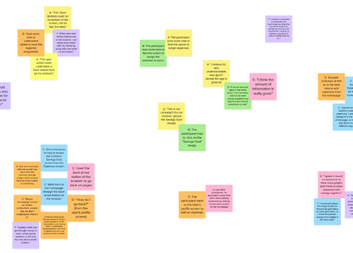
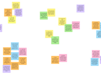
Affinity diagram
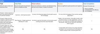
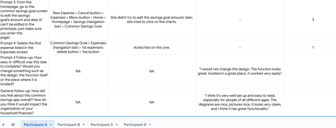
An affinity diagram was created to gather and organize feedback from the usability testing participants and iterate the design where needed.
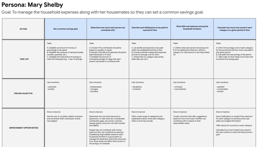
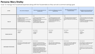
User Journey Map
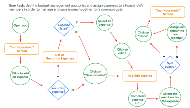
A user journey map helps visualize the user's interactions with the app, identify pain points, and uncover opportunities to enhance the overall user experience.
Accessibility considerations
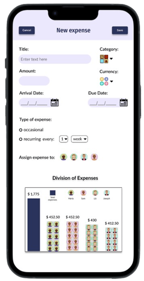
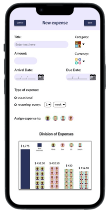
Considerations as to color contrast and texture were implemented to the mockups.
1.
Proper color contrast was used to ensure that text and visual elements were easily distinguishable for all users, including those with visual impairments such as color blindness or low vision. This improves readability and usability, making the design more inclusive.
2.
Colors along with shapes were used in charts to enhance accessibility, ensuring that information is distinguishable by texture as well. This approach makes the charts easier to interpret for users with color blindness or other visual impairments, improving clarity for everyone.
Takeways
Impact:
"I think it's very well set-up and easy to read, especially for people of all different ages. The diagrams are nice, pictures nice, it looks very clean, and I think it has great functionality."
Eleanor, 19, USA
“I think, for many people, especially people who have a difficult family setting and where money might be an issue (...) it would be quite useful. So I think it's a great idea."
Steffen, 40+, Germany
An appealing but simple design is the first step to make people feel satisfied while using a product. Plus, features that confirm a user’s actions are never too much.
What I've learned:
Gallery
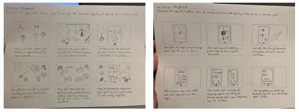
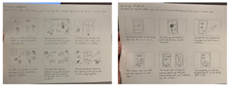


Big-picture and close-up storyboards
Paper and digital wireframes


Mockups
