HomeSavings Responsive Website
A responsive website was created to serve as a first-time user experience (FTUX), where visitors would get to know the product, sign up and download the app.

Project duration:
August to October, 2024
The product:
Project overview
Users need a first-contact with the product before downloading it regardless of their device type.
The goal:
To design a responsive website so users can interact with the website content across multiple devices.
The problem:
My role:
Generalist UX Designer
Responsibilities:
Responsible for all design phases of the UX Design process.
Challenges and outcomes:
Understanding how to present information effectively on the website to create a strong first impression of the brand and product, while ensuring the registration process is quick, easy, and includes relevant onboarding questions to offer tailored plans.
Design stages
See below some of the elements used in my design process:
Sitemap
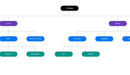
A flat sitemap based on my competitive audit document and decision on a hierarchical website structure.
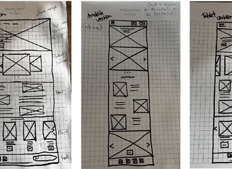
Paper wireframes
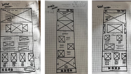
The final versions of paper wireframes for desktop, mobile, and tablet devices, with the hero image and CTA button appearing above the folder.
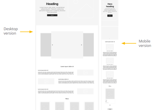


Digital wireframes
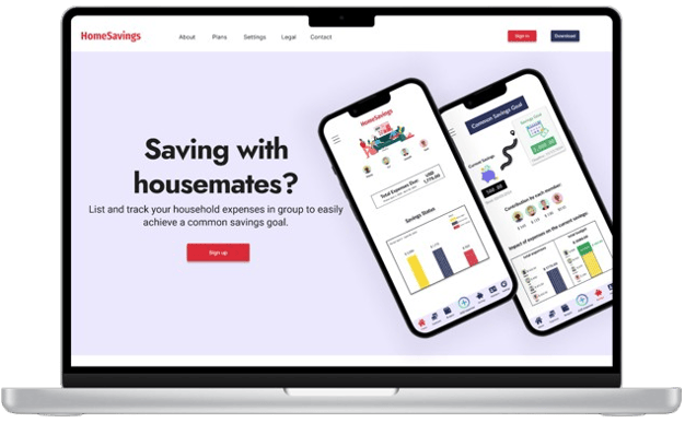
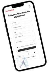
Wireframes for the homepage and registration steps were created on Figma for the desktop and mobile versions of the website.
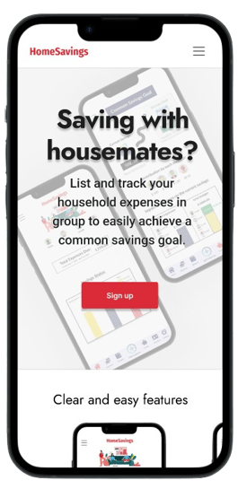
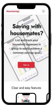
High-fidelity prototype (mobile)
Both low and high-fidelity prototypes were created for the responsive website. See the other versions in the gallery below.
Design choices
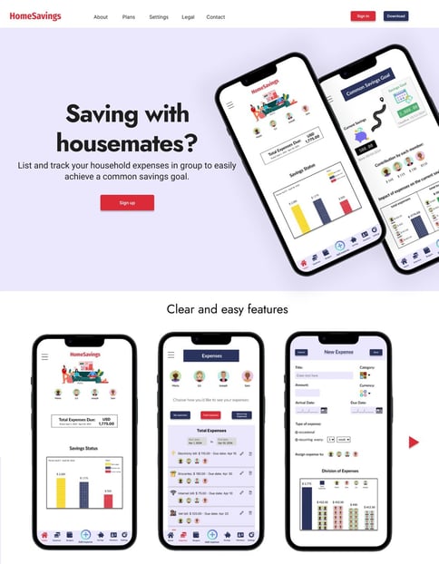
Designing with the fold in mind was important to ensure the effectiveness of the content's hierarchy.
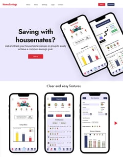
Hero image
Z-shape layout
Graceful degradation
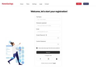
I designed from the largest screen (desktop) to the smaller screen (mobile) as it provides more room to make visual design decisions, prioritizing a robust desktop layout and ensuring the design remains functional and aesthetically pleasing as it scales down.
I chose a fixed navigation bar because it keeps essential links always accessible (such as CTA buttons), improves usability, and creates a smoother browsing experience, especially for users scrolling through long pages.
Fixed navigation bar
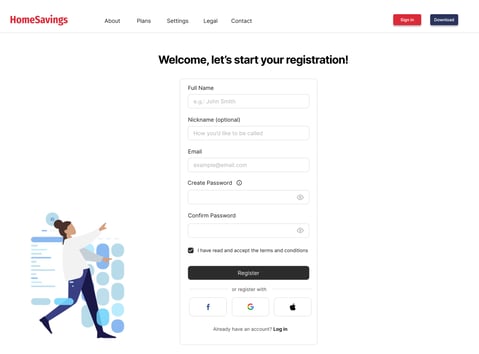
The large banner above the fold catches the user's attention and gives them a glimpse into the type of product being presented.
I went for a z-shape layout since it naturally guides the eyes across key content in an intuitive flow, making the design clean and easy to navigate.
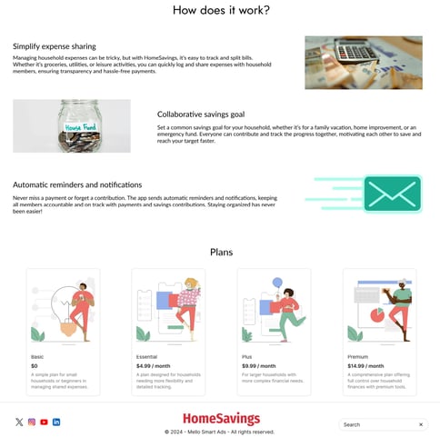
Cards
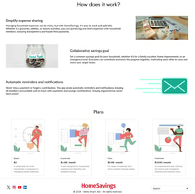
Cards are visually appealing, easy to compare at a glance, and keep the design organized and approachable while making the choices feel interactive and user-friendly.
Carousel
Carousels save space, make the design more dynamic, and let users explore content at their own pace while keeping the page clean and visually engaging.
4 Cs
Consistency, continuity, context, and complementary were words I bore in mind to ensure a smooth experience accross devices.

Other considerations
Gallery
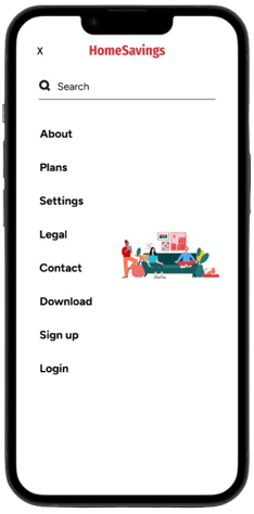


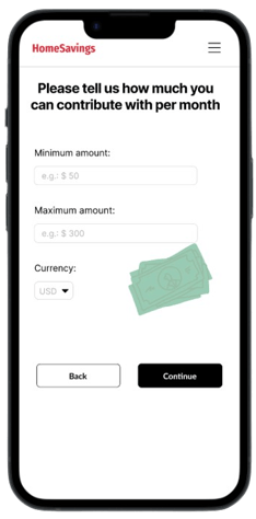
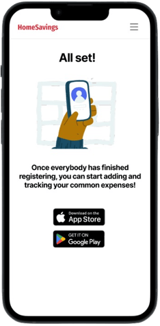
Mobile screens (390 x 844 resolution) of the responsive website
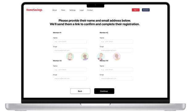
Desktop screens (14.2 inches) of the responsive website


Implementing some interaction in the prototype by making buttons change shades and shapes for the desktop version
